Establishing a Startup’s Brand Identity
Hover Studio
Timeline: 4 Weeks
My Role
Illustration, Wireframing, UX Design, Animation, Graphic Design
Context
Hover Studio is a design agency based in Bangalore, India. It was essential for the agency to create an identity by building a website to list the services offered and showcase the work done. Additionally, a logo and business cards also had to be designed.
Problem
How might we establish a new design agency on the web, from the ground up?
How might we design a minimalistic logo for a design agency that speaks for itself?
How might we design a minimalistic logo for a design agency that speaks for itself?
Process
A logo is the face of any brand or company. To start things off, we had to design a logo that would be an apt fit.
The first thing that comes to a designer’s mind when you think of the word - “Hover” - is a cursor hovering over an object. That is precisely what we went with, since it made the most sense and also felt close to home as a designer.
The first thing that comes to a designer’s mind when you think of the word - “Hover” - is a cursor hovering over an object. That is precisely what we went with, since it made the most sense and also felt close to home as a designer.
Logo iterations
Going Back to the Drawing Board
The multiple versions of the logo did convey the meaning, but did not look really pleasing to the eye. We went back to sketching a few other options and finally arrived at this.


Preparing for the Journey
Once the logo was good to go, we began our process of designing the website. I sketched a few wireframes using Crazy 8s to generate some quick ideas. I did this process about a couple of times and arrived at one final design that the team and I voted upon.
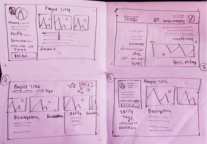
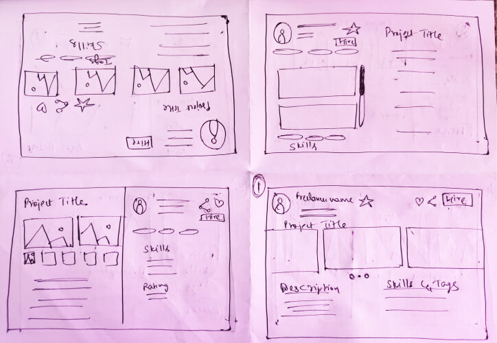
Put 8 minutes on the clock and sketched away
In the early stages, a few key design decisions had to be made including -
1. Animated Vector Illustrations v/s Quick Page Load Speed
2. Light mode v/s Dark Mode
However, later we went ahead and chose all of the above. Let me explain.
1. Animated Vector Illustrations v/s Quick Page Load Speed
2. Light mode v/s Dark Mode
However, later we went ahead and chose all of the above. Let me explain.
Animated Vector Illustrations v/s Quick Page Load Speed
We decided to have a Services section where we’d list out the services offered. I realized it would be best if we had animated illustrations to portray the same, without compromising on the webpage load speed. I was grateful to work with engineers who did not see this as a problem and were very accomodating. This gave me my space to create dynamic and colourful illustrations. In the end, it was a win-win.
Illustrations for the “Services” section
Hero Illustration - Process
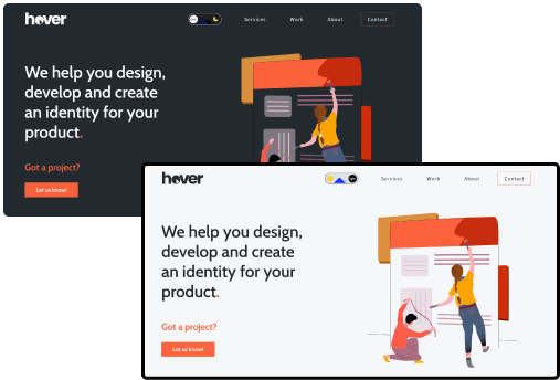
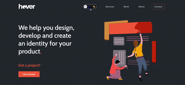
Light Mode v/s Dark Mode
A discussion that divides a room into two. But we had to make sure all parties are satisfied in the end.
We came up with a solution to have a switch right up in the navbar, which would toggle between dark and light modes, as the user wishes to.
One obstacle here, was that not all colors look good on a light and a dark background. My subgoal now was to come up with a style guide that sits well on both scenarios.

#22292F

#FD613A

#F6F7F9
Toggle Switch
Outcome
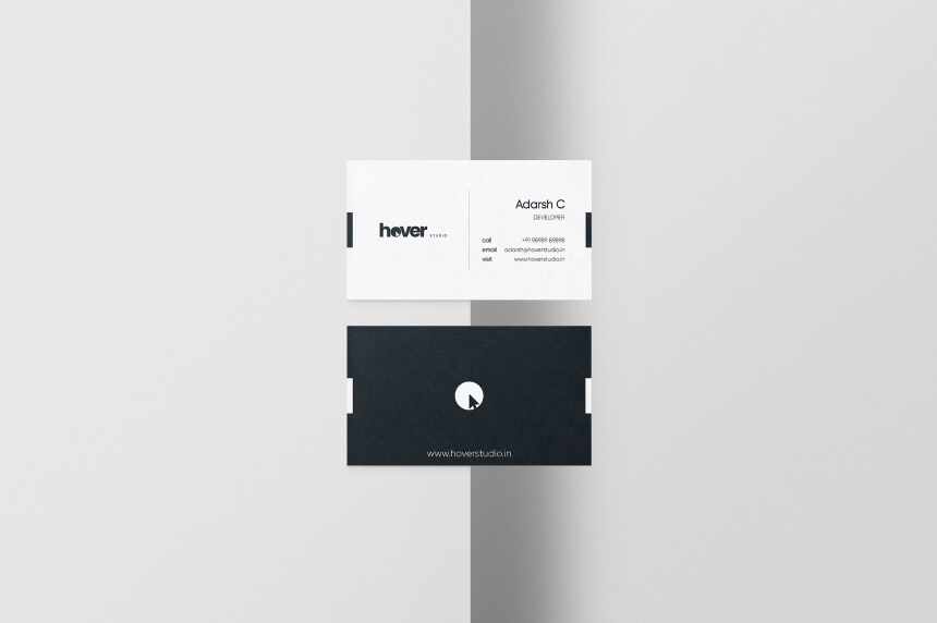
Business Cards for employees at Hover Studio
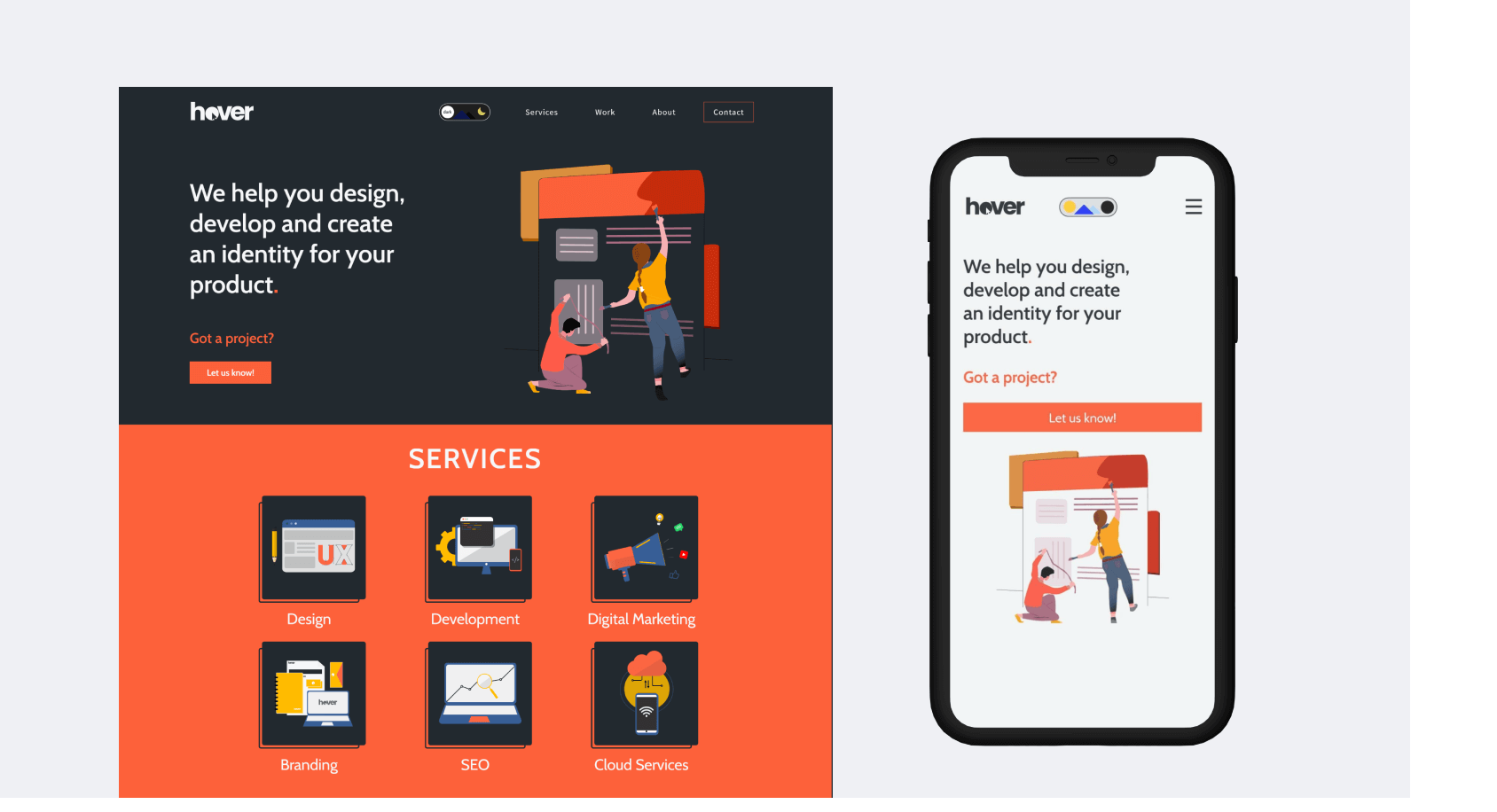
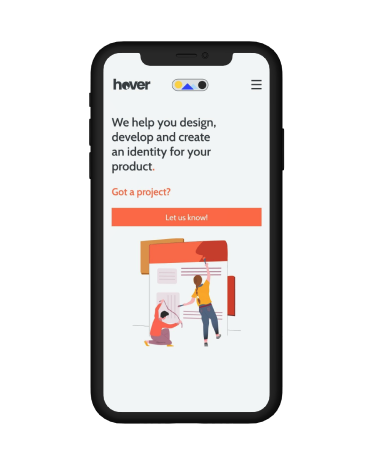
Landing Page - Web and Mobile Screens (Dark and Light Mode)


Takeaways
In the initial days of my design career, I was into graphic design and illustrations for the most part. But later as I switched to product design, I did not get to illustrate too much. But in this project, apart from illustrations, I was also able to work on animating them using Photoshop to provide an overall interactive experience. This was also one of my first projects where I worked very closely with engineers, which made me empathize with them and handoff my designs in a very efficient manner.
Visit the live website: hoverstudio.in
