Digitizing the Application Experience
PRSSV Institue of Performing Arts and Heritage
Timeline: 2 weeks
My Role
UX Research, Information Architecture, UI Design, Micro-Interactions, Creating a Style Guide, Project Management
Context
PRSSV was established over 50 years ago with the aim of giving people of all walks of life a chance to experience and learn the performing arts of India. It is the custodian of the Benares Baaj Archive in West London. Today, there are approximately 1000 candidates appearing annually in approved examination centers and partner institutions in London and other cities of the UK.
PRSSV previously had a static website showcasing the institute’s examination wing.
The goal was to restructure the user flow, redesign the website, migrate codebases and integrate an online application system where registered students can apply online to take up exams.
PRSSV previously had a static website showcasing the institute’s examination wing.
The goal was to restructure the user flow, redesign the website, migrate codebases and integrate an online application system where registered students can apply online to take up exams.
Problem
For a student to apply for an examination, he/she had to download and print the application PDF, write in their details and mail it to PRSSV.
This was tedious for both the student and the institute, as they had to go through long and time consuming processes of sorting out applications manually. Additionally, due to the pandemic, exams were being conducted online which led to more complex situations. This issue had to be addressed.
A few challenges to be noted were:
1. How might we improve website navigation and architecture?
2. How might we design a modern and clean interface?
3. How might we optimize the information and content?
4. How might we enhance the overall online experience?
Process

Initially, I gathered information about the typical user who might visit the website to apply for an exam. According to my research, a good number of students were about the age of 10-13. This implied that the student’s parent would be our primary user.
I had to make sure the whole applying process is as quick and hassle free as possible for a busy London parent.
In order to accomplish this, I broke down the application process into a series of steps.
I had to make sure the whole applying process is as quick and hassle free as possible for a busy London parent.
In order to accomplish this, I broke down the application process into a series of steps.


One of the most important aspects of this project was to improve site navigation. The old website was very cluttered with broken and redundant links. It was essential for the user to hop on the site and comfortably navigate through the different sections of it.
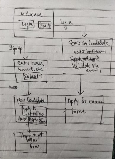
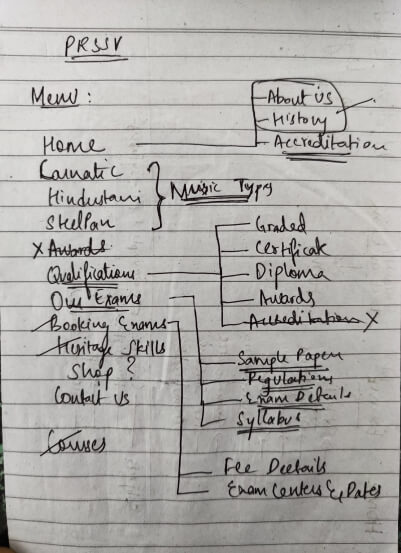
Figuring out the most efficient user flow by removing redundant links and altering navigation.

Final Sitemap
Final Sitemap
I wanted to keep the user interface minimalistic and clean, and mainly focus on the functional aspect of it. After sketching a bunch of wireframes, I was able to arrive at a modern looking interface.
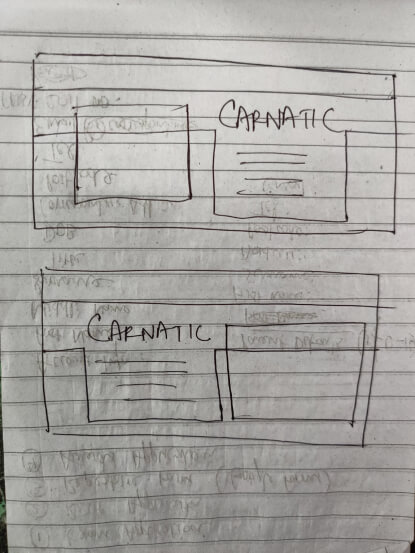
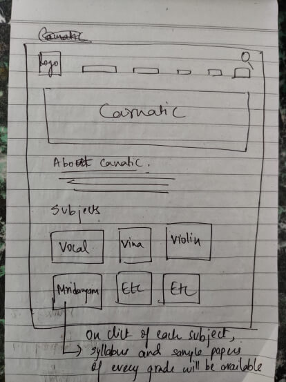
A few (average looking) wireframes. But hey, it’s a sketch and I was able to come back to it and infer meaning from it, so it’s a win.
Since this website consisted of 50+ screens, we created a design library to accomodate change in layout or adding new components in the future. This allowed me to work closely with developers and take them through each and every component, so that when the website is built, it matches my design, pixel to pixel.


A peek into the design library
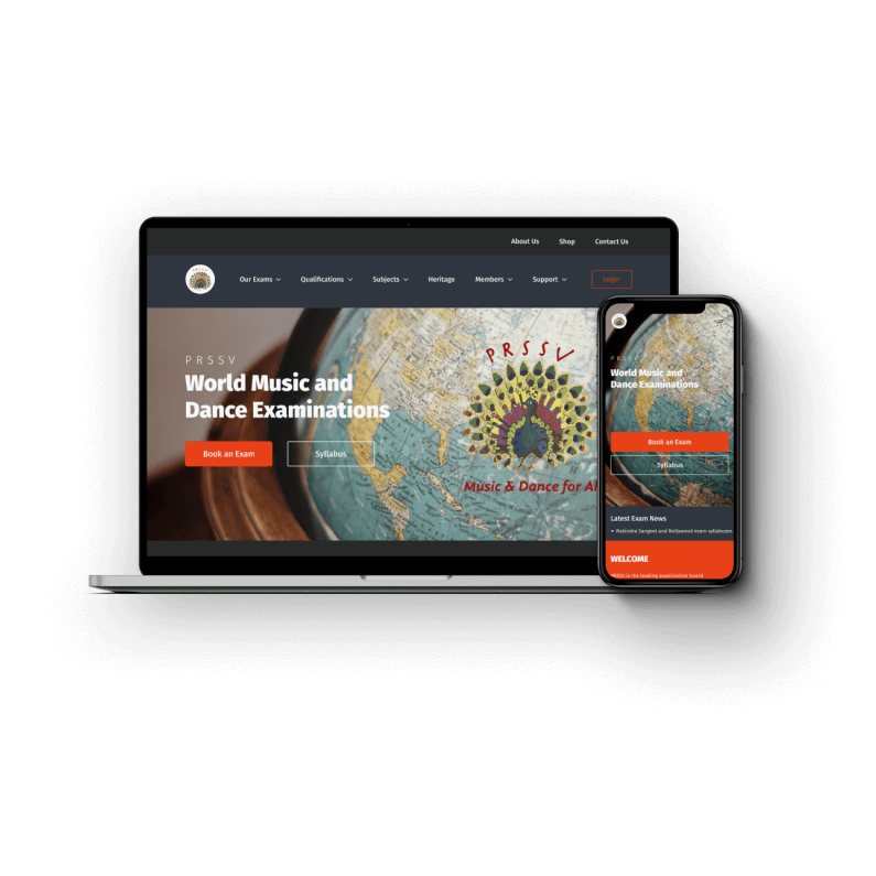
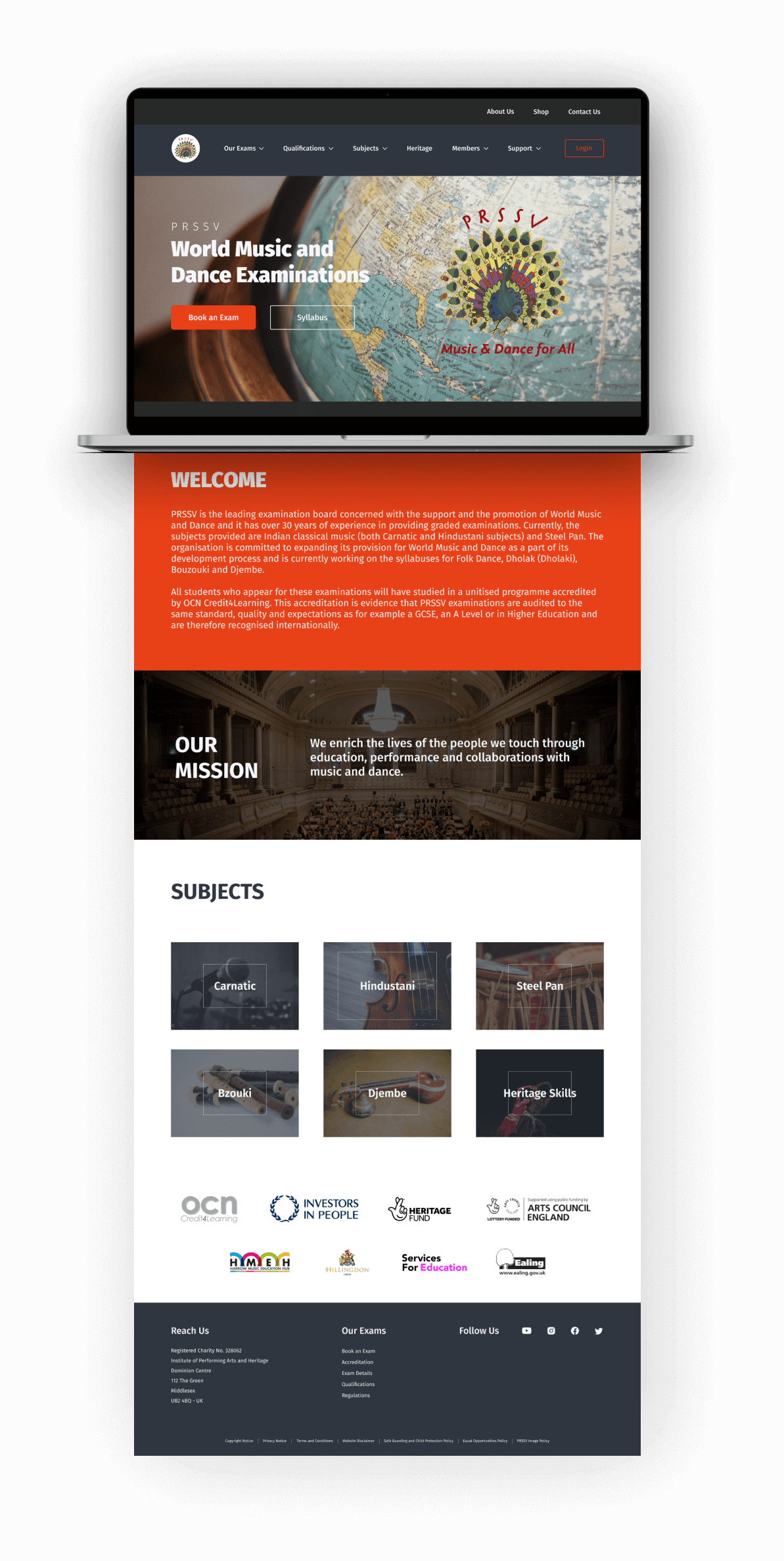
Outcome
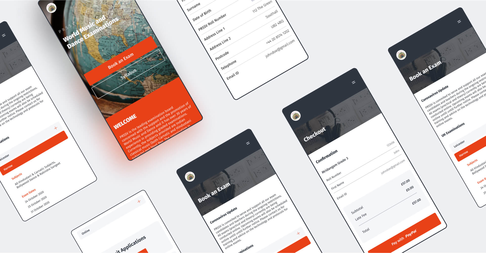
Mobile Screens
Takeaways
Building this web application came with its own set of challenges. It made me understand the importance of designing to a niche user group. Building a web application for a large music institution meant that the design needs to be easily scalable. Considering we had multiple user groups, including the admin in the backend, designing completely different interfaces along the lines of the existing design language and principles was a key takeaway. By leading a team of 4, I was able to successfully carry out the project and deliver on time.
Visit the live website: sangeet-examinations.co.uk
