Building & Scaling with Design Systems
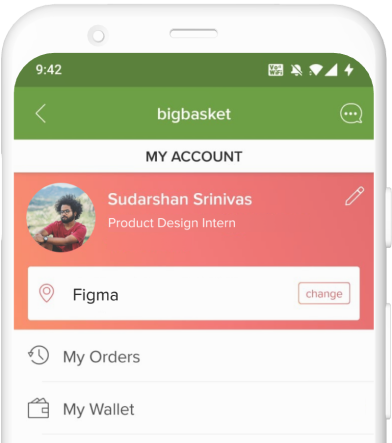
Bigbasket
Timeline: 3 months (Internship)
My Role
Research, UI Audit, UX Design, Documentation
Context
Bigbasket records up to 20 million orders a month, especially due to the surge that was noticed during the pandemic. It is available on all major platforms — iOS, Android and PWA. As a summer intern at the largest online supermarket in India, I got the opportunity to work on a couple of interesting projects, one of them being setting up a design system from the ground-up.
Problem
As one of the biggest players in the grocery-tech space in the country, Bigbasket has a huge catalog of SKUs ranging from F&V to beauty and hygiene. Being quite a dense application, it contains a ton of screens. This in turn resulted in unorganized styles vis-à-vis type, color, iconography etc.
When a designer in the team had to work on a new feature or solve for a newly discovered problem, they had to invest a fair share of their time in order to build out components and screens that were already in the production app. Say, 5 different designers work on 5 different problems — there is a very less chance that all of them have followed a particular spacing guide or a pixel perfect button width. When this kind of situation arises, it results in entropy/disorderliness — right from the design files to the final shipped product.
When a designer in the team had to work on a new feature or solve for a newly discovered problem, they had to invest a fair share of their time in order to build out components and screens that were already in the production app. Say, 5 different designers work on 5 different problems — there is a very less chance that all of them have followed a particular spacing guide or a pixel perfect button width. When this kind of situation arises, it results in entropy/disorderliness — right from the design files to the final shipped product.
How might we solve for UI consistency and scalability?
How might we limit the styles to a reasonable number?
How might we document UI styles and components clearly?
How might we allow designers to maximize their time on the UX aspect of a problem?
Research
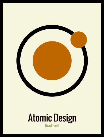
I was familiar with Brad Frost’s Atomic Design. The concept of atoms to pages is a basic yet necessary step towards working on design systems. As I slowly started to scratch the surface, I began doing some research on how other products maintain their design systems too. A few that I was inspired by were Microsoft’s Fluent, Shopify’s Polaris and Google’s Material Design. These gave me an in-depth understanding on some of the best documentation practices.
Process
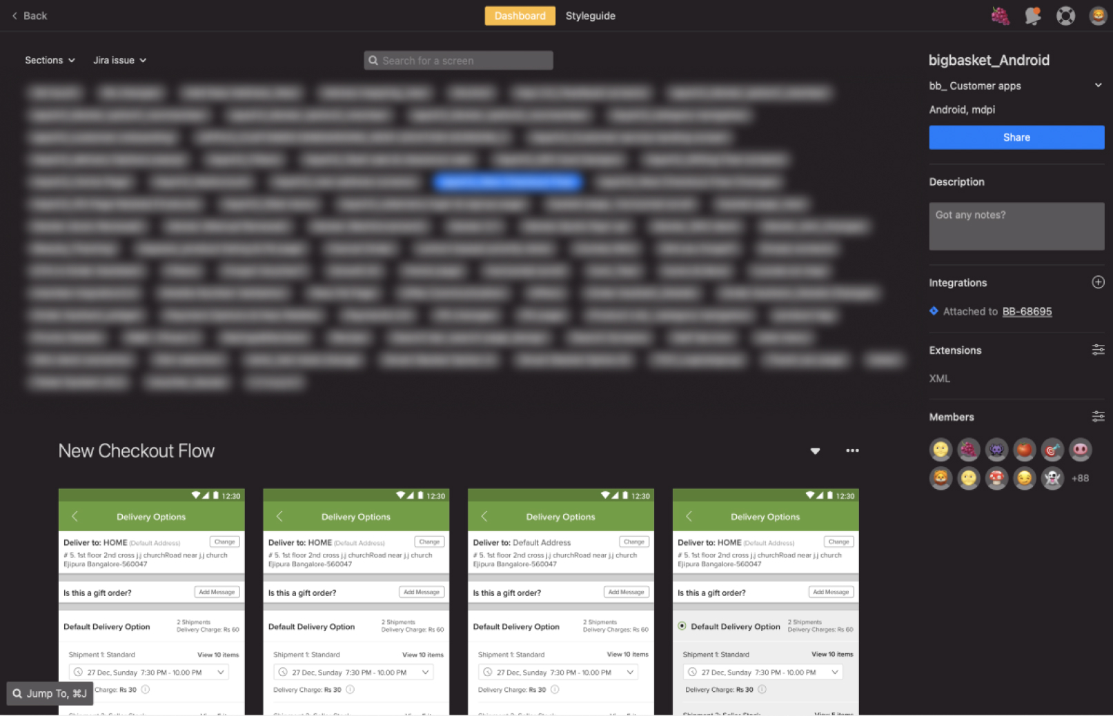
Since we were a team of 4 working on Melon (Bigbasket’s Design System), we used spreadsheets to assign different components among ourselves. We would work on them and have regular catch-up sessions where we shared our progress.
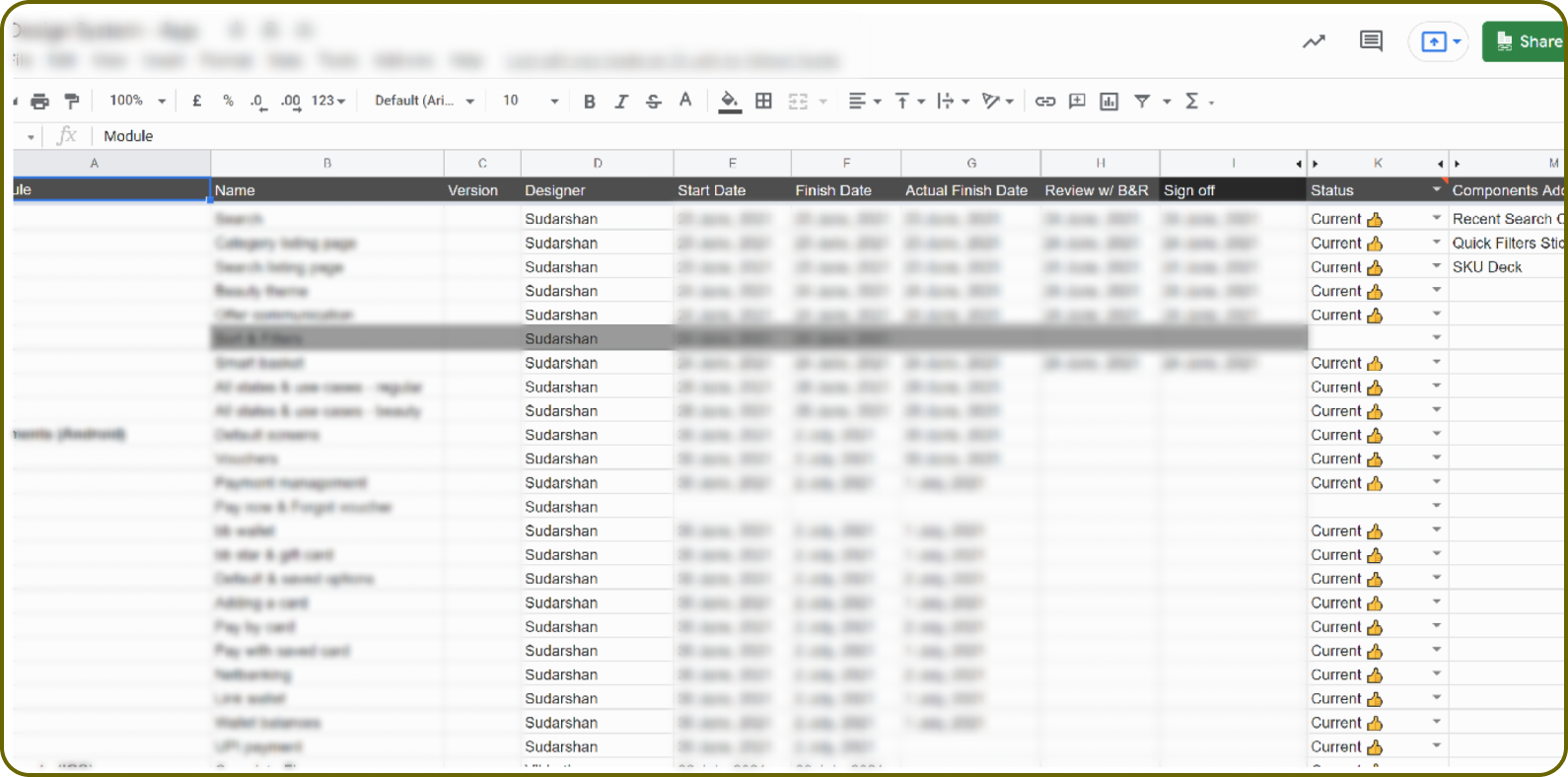
Design System Task Spreadsheet: Blurred due to confidentiality
The process would slightly vary based on the module I was working on, but roughly, it looked like this:
- Audit
- Check for Inconsistencies
- Design
- Test
- Document
Audit
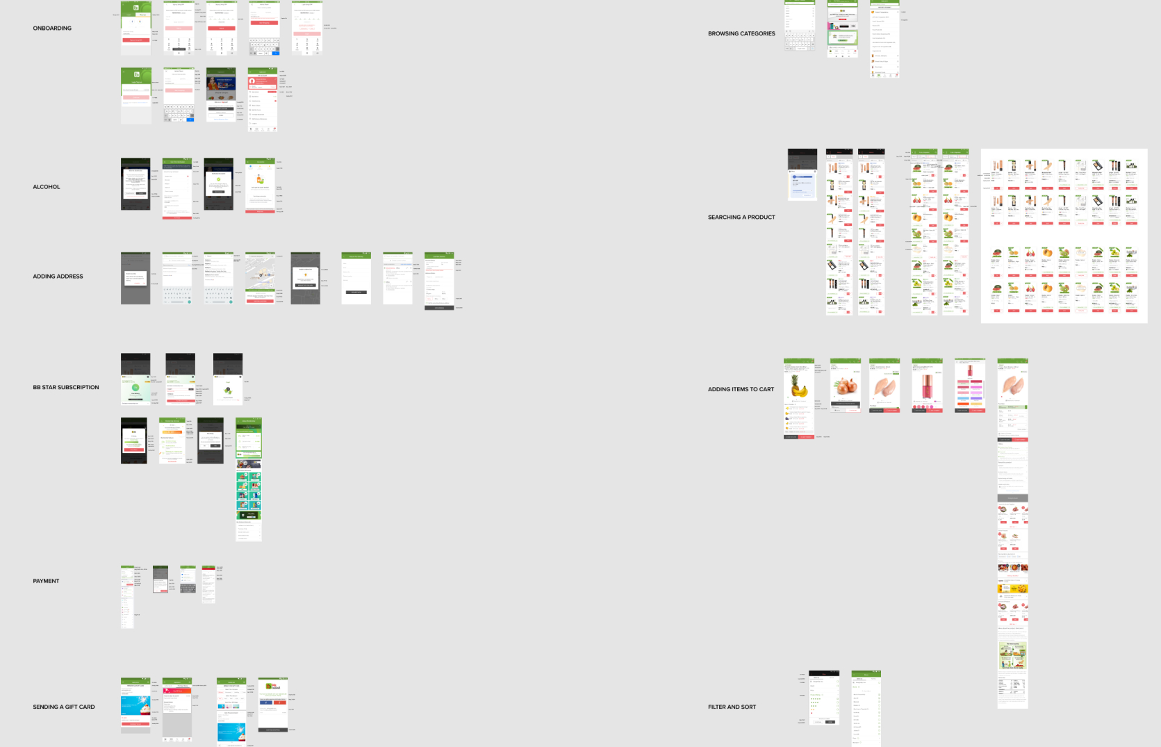
Before designing a particular component, it was very important for me to understand the user flow completely. I thoroughly studied each and every use-case that was associated with a particular component and took a bunch of screenshots, which would later serve as a source of truth.
By the end of the audit, I made sure that I understood the ins and outs of the component’s need, purpose and how it contributed to the app without missing a single use-case.
By the end of the audit, I made sure that I understood the ins and outs of the component’s need, purpose and how it contributed to the app without missing a single use-case.
Figma Audit File
Zeplin Repo
Checking for Inconsistencies
Since the user flows were fresh in my head, it was ideal to check for inconsistencies post-auditing. We maintained a separate Hygiene Sheet just to fix and update minute design changes. As I was encountering these minor inconsistencies, I was also given the freedom to suggest improvements for the same. These 2 steps generally went hand-in-hand. But at the same time, it is important to respect and understand the existing design and why it was done a certain way. Putting myself in the shoes of that designer and knowing more about the context resulted in better improvements. For the most part, we were looking to solve these inconsistencies with our design system.
Design
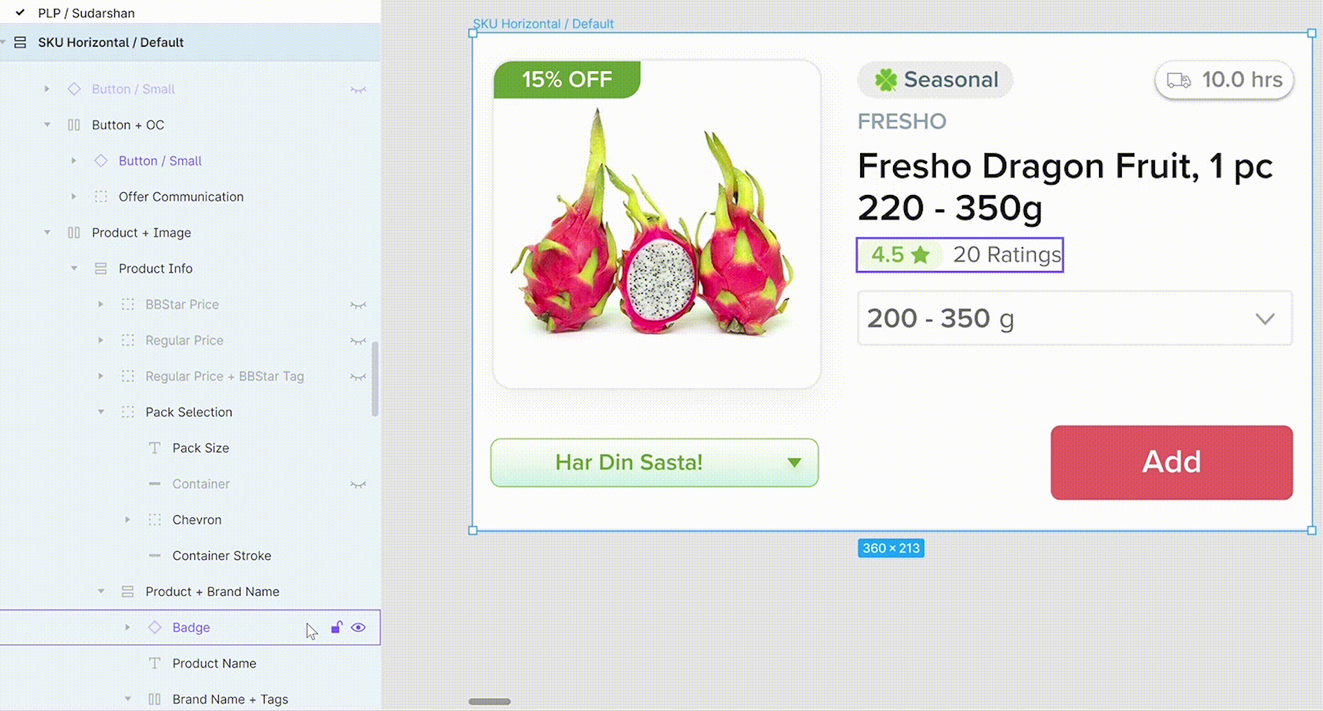
Upon understanding the user flow in detail, it was time to design the components. At this stage of the process, I realized looking at it from a component level (micro) alone might not be enough, but it’s also necessary to be looking at the bigger picture at a macro level. Sure, detailing is key, but the context in which it is presented is equally important too. A few modules that I worked on were Ratings & Reviews, Sticky Bars, Name Tags, Empty States, Chatbot and Tabs.


Ratings & Reviews: Color & Spacing


Tabs: Anatomy, Spacing and Typography
All components in Melon were made using Auto-Layout. For most components, we leveraged Figma’s component-variant feature which turned out to be very efficient.
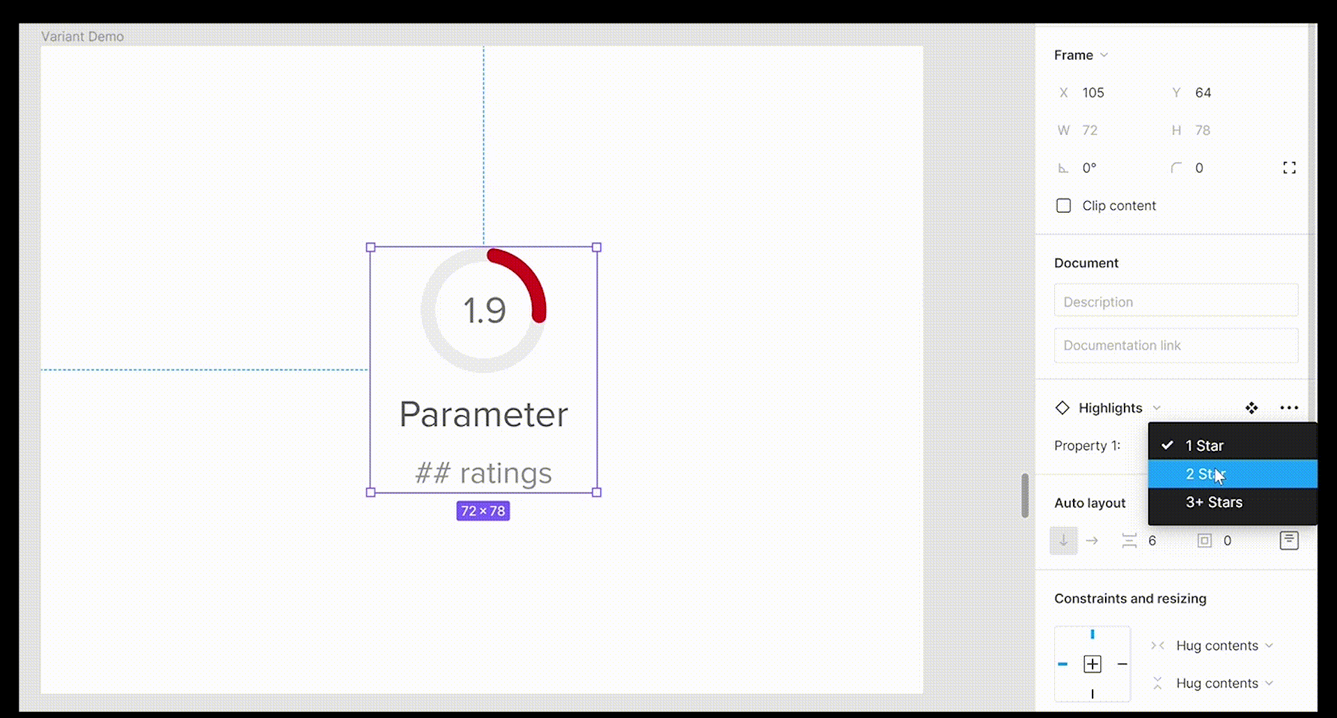
Leveraging Components & Variants
The Power of Auto Layout
Test
Post designing a particular module, it was time to put it to test. Testing is an essential step in this process — this is where the macro aspect of the design comes into picture about how a small component fits into a standard screen with other elements in it. This step is a good time to also check whether:
- All use-cases and edge-cases are covered
- The component is designed for Android and iOS
- Layers and Frames have been aptly named
- Color & type styles and the grid system strictly adhere to the guidelines
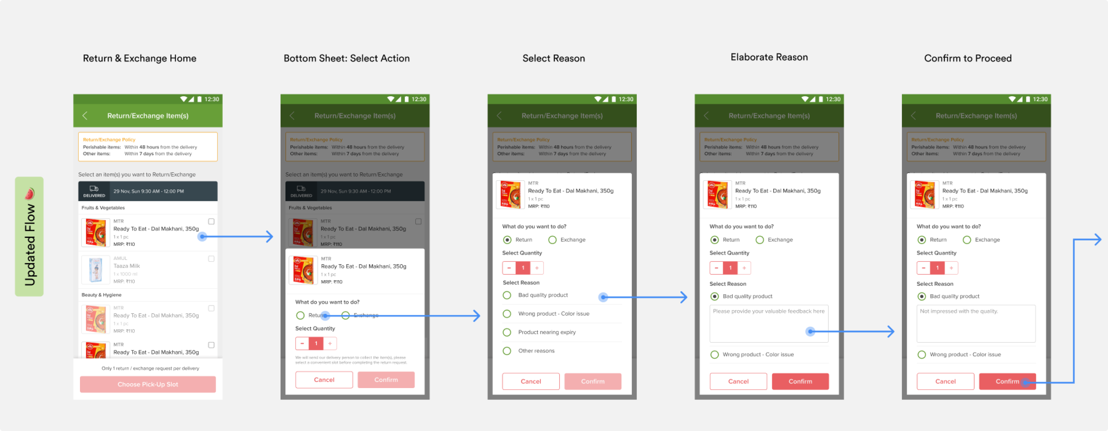
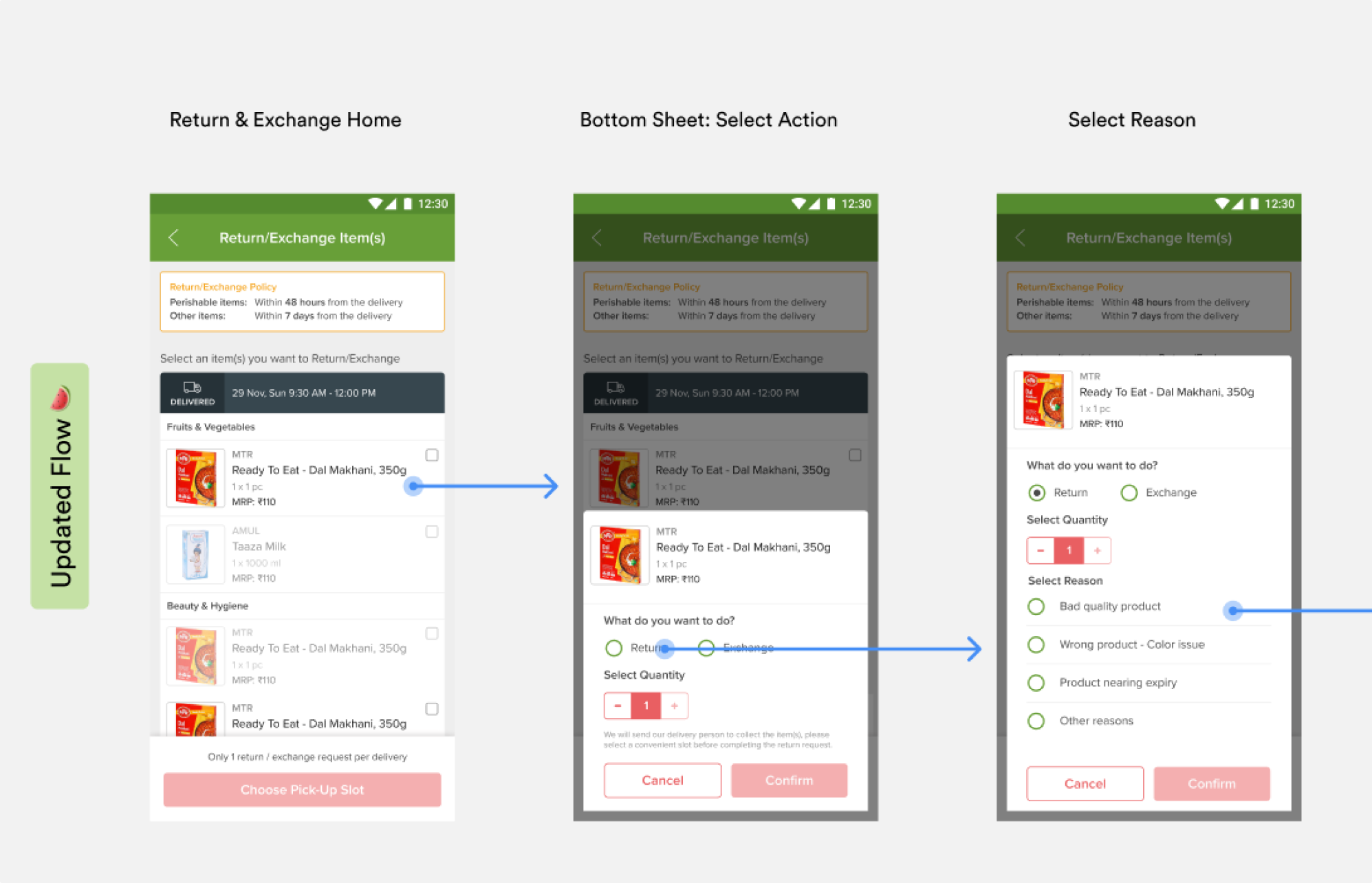
Return & Exchange User Flow Designed with Melon Components 🍉
For example, in the Return and Exchange flow (See Image), by re-designing the complete flow using components from Melon, we were able to test Bottom Sheets, SKUs, Buttons, Text Fields, Icons, Sticky Bars, Cards, Images, Navigation Bars and Widgets! By doing so, we were able to tweak the components a bit here and there so that it doesn’t break under any circumstance, thereby giving it a polished look and making it ready for all use-cases.
Document
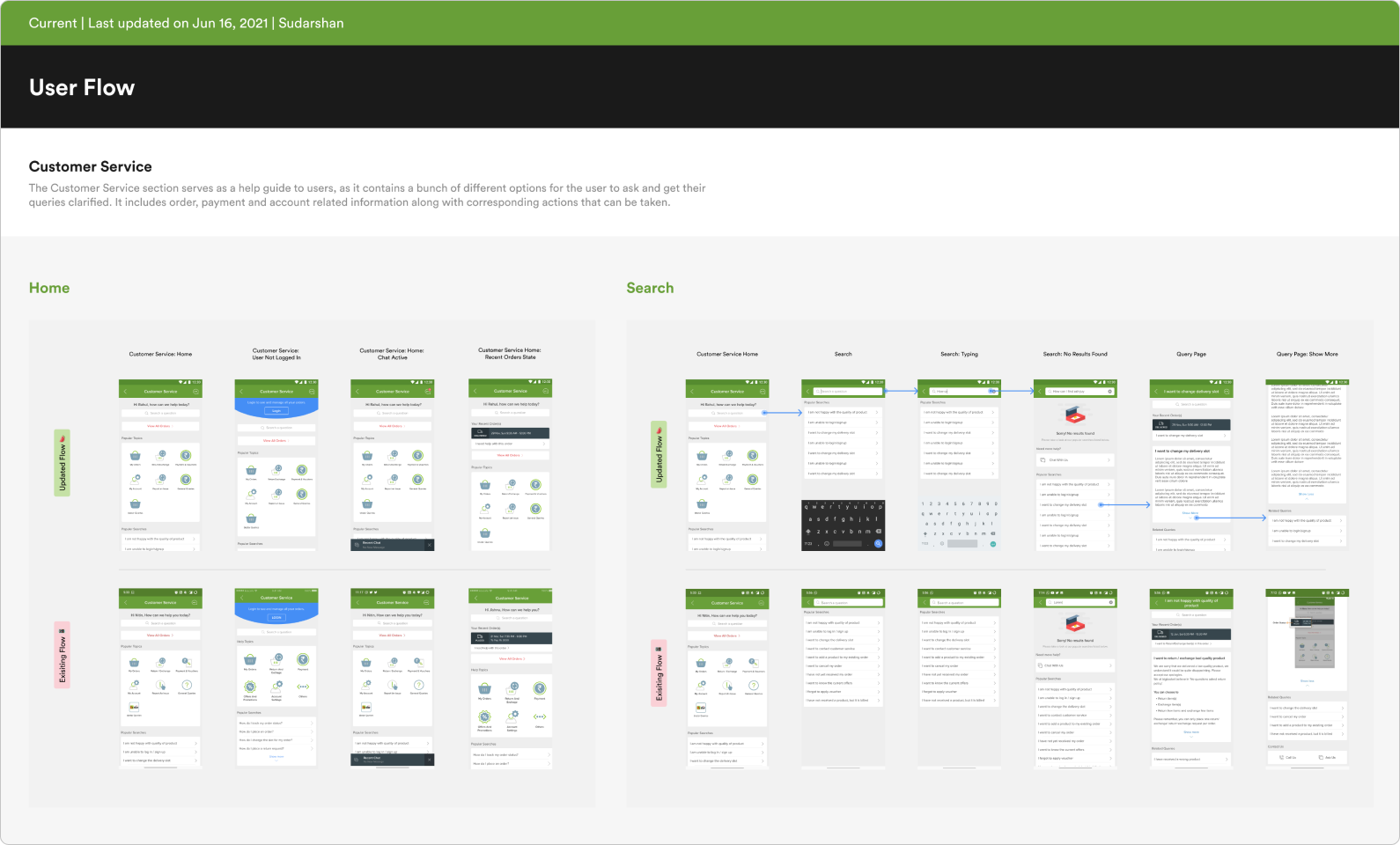
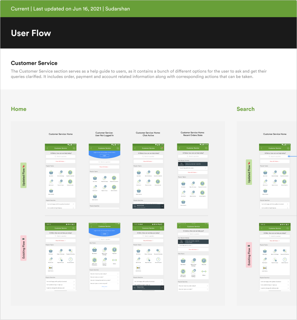
One of the main purposes of building Melon was that it could be used by designers, engineers and PMs to bring about consistency and a solid set of design principles and values about BB Design. In order to do so, documenting the design in such a way that all stakeholders involved can look it up and understand the core of the company’s design principles is the way to go. As a designer, this is the part of the process which requires a lot of empathy. At the end of the day, Melon is built to bring about ease and harmony between design and code, and also for people outside the design team to have a glance at it to understand the usage guidelines and Do’s and Don't’s. The documentation for each component and pattern varied slightly, but overall, it delivered the message in a detailed yet concise manner.
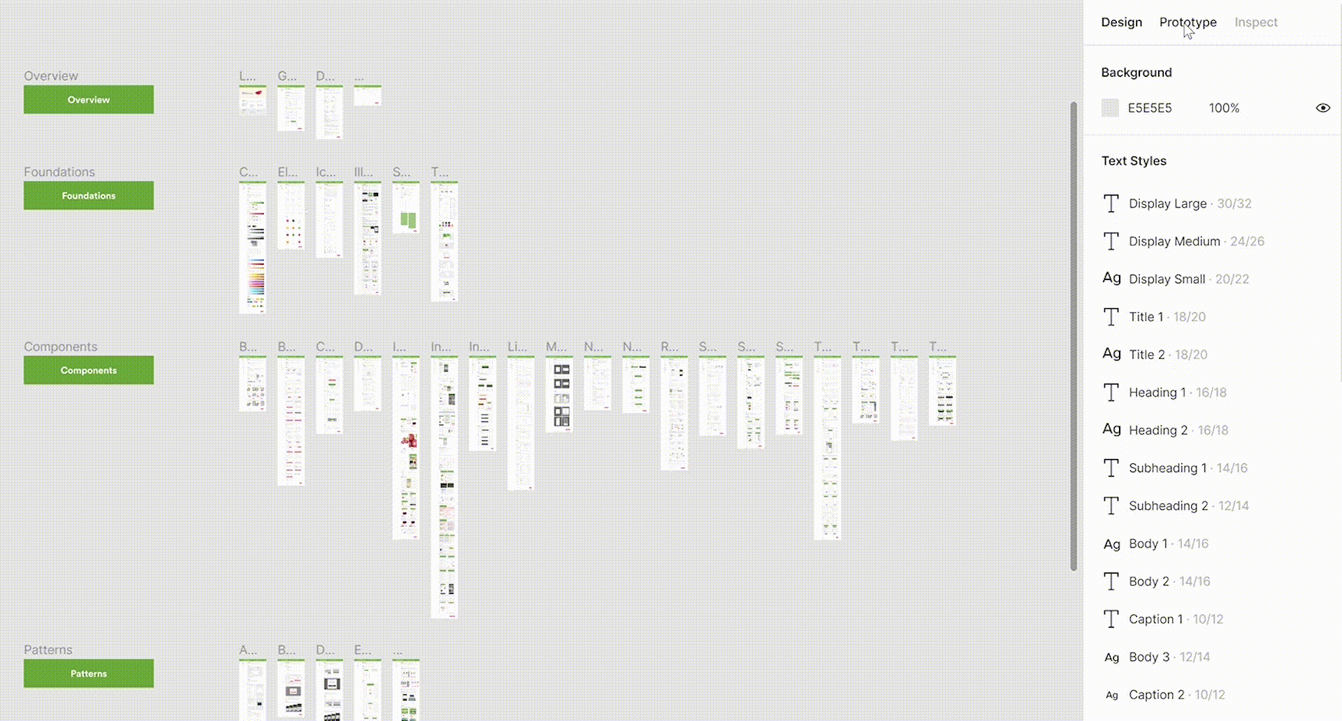
A clickable prototype of the documentation. Melon was divided into Foundations, Components and Patterns.
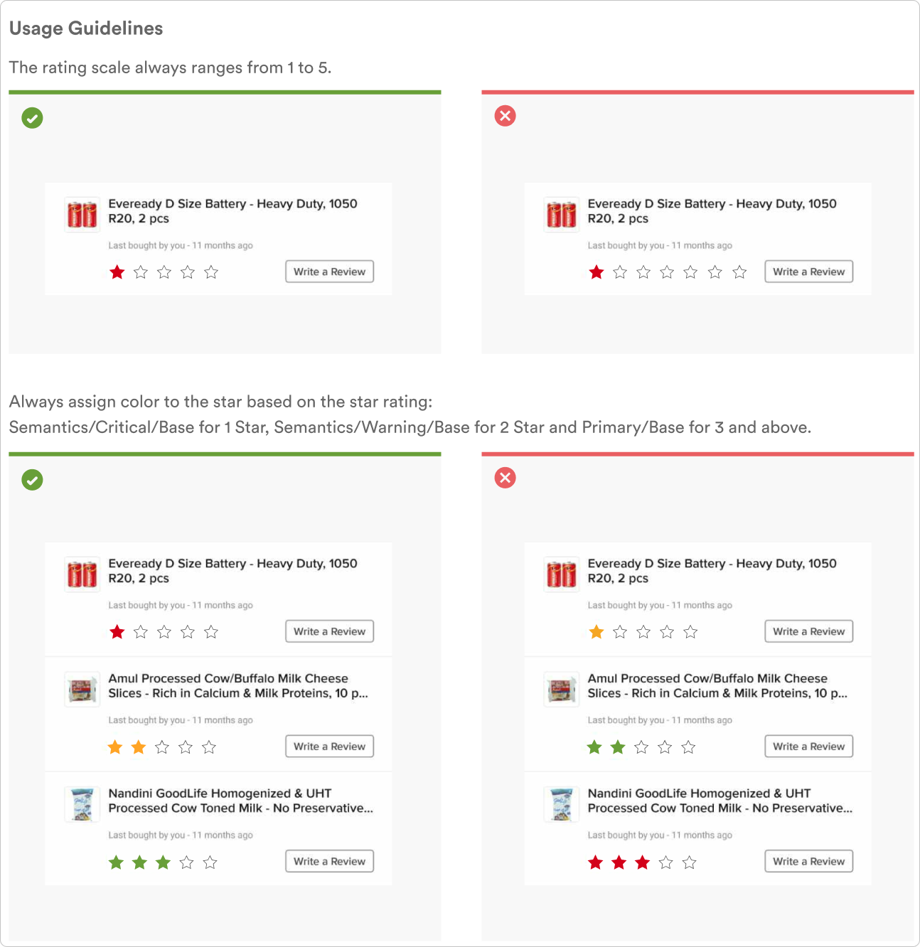
Ratings & Reviews: Usage Guidelines
Takeaways
- Designing for a product that is used across India by millions of users is a great responsibility that I was ready to take on. Designers may tend to bring bias to the table, but learning to remove that by making decisions based on data metrics is always the right way to go.
- There is no perfect solution. Design is a collaborative back-and-forth process where you iterate constantly to finally land on the closest-to-perfect solution.
- Design Systems need to be constantly worked on aiming to perfect scalability. In big organizations, designing to scale is a challenge and design systems certainly help ease the load.
